3/5
Don't understand the AR icon and don't use this feature.
I didn't immediately understand what it could be used for, I stayed on the map view.
How to enable better management of trips related to major events?
(concerts, festivals, matches, trade shows, …)
BlaBlaCar is the global leader in carpooling. Launched in French in 2006, it operates in over 25 countries and has more than 100M users.
Today, nothing is done in the app to address the "major events" use case (matches, concerts, festivals, trade shows, …) Trip planning and organization could benefit from some improvements in the product.
18%
of these trips are published on the platform.
8%
Customer service tickets for these trips
How to enable better management of trips related to "major events"
(concerts, festivals, matches, trade shows, …) ?
A decrease in customer service tickets regarding this type of trip.
Fewer cancellations from people unable to find each other or for whom trip details were unclear (meeting point or other).
We conducted a benchmark to explore concrete solutions for our needs:

Find my parking car
Map view visualization with route and departure/arrival points.

Uber
Bottom-up menu providing driver information.

Google AR
Learning progress visualization using a gauge.

Happn
Chat feature for participants to communicate and find each other.
To move forward in this creative process, we first identified central themes, then imagined varied solutions before validating the ideal user journey together.
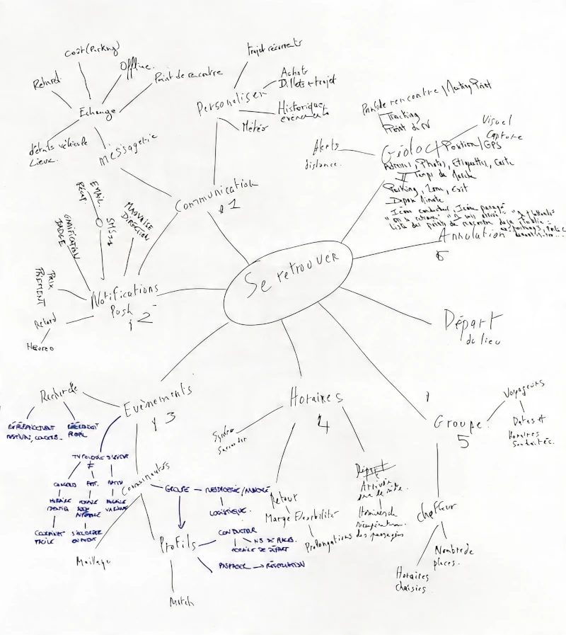
Quick messages
In uncomfortable situations (festivals...), useful template texts that facilitate exchanges.
Map orientation
Map with route + popup containing departure information.
AR view mode
At events, AR provides a 3D perspective for orientation, with flat view as an option.
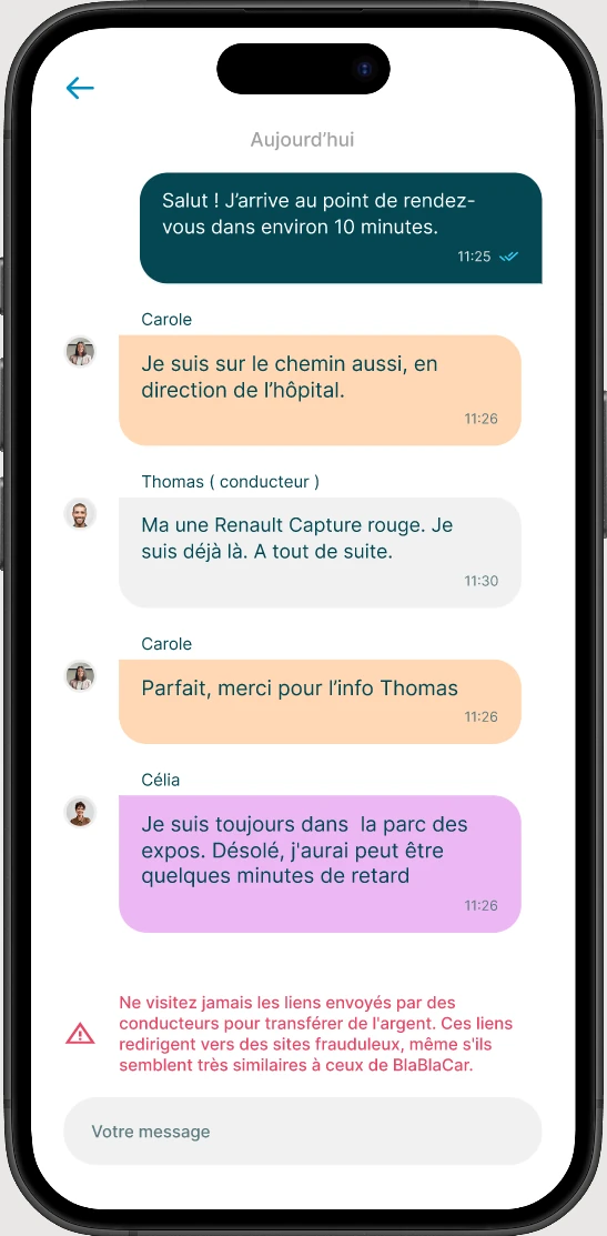
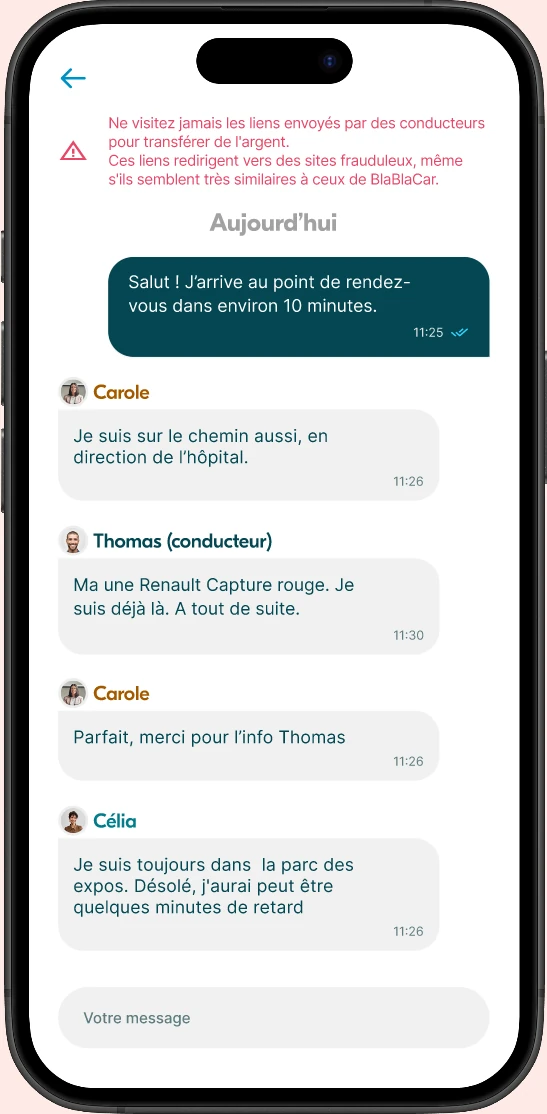
Chat, messaging
Access direct communication with passengers and the driver.
Notification alert
Display a notification to warn the user they are heading in the wrong direction.
Presence indicator
Notify the user that departure is approaching with a count of passengers already present.
With our ideation and the information gathered, we imagined a scenario to facilitate the management of trips related to major events. Major events pose specific mobility challenges: noise, crowds, and difficult wayfinding. We designed a scenario and prototype to test how the application could better support users in these situations, starting from the end of an event.
It's the end of the day at the Foire de Paris. It's 6:00 PM.
You've just spent several hours in Hall 1 (Porte de Versailles), with a huge crowd and a lot of noise.
You've booked a BlaBlaCar to return home to Melun (1 rue du Château). Your driver Thomas is supposed to pick you up at 6:10 PM, just 10 minutes from now, at the Vaugirard hospital at 10 rue Vaugelas, 75015 Paris.
Your task is to open the BlaBlaCar app and use the information available to reach your meeting point.
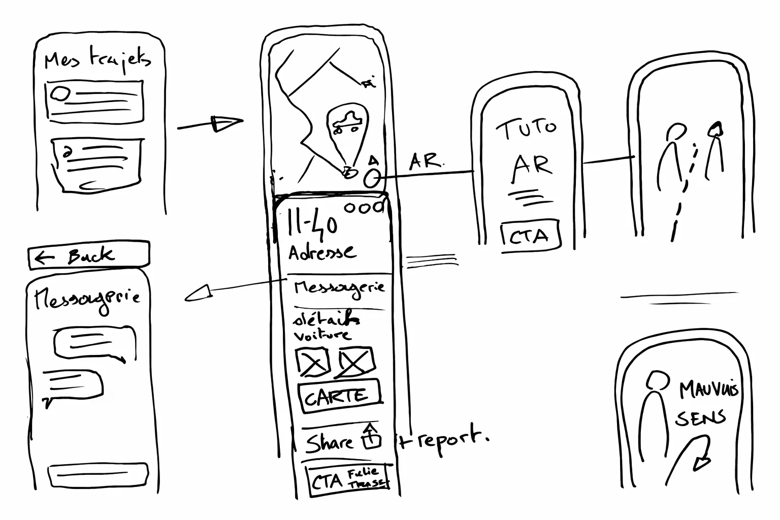
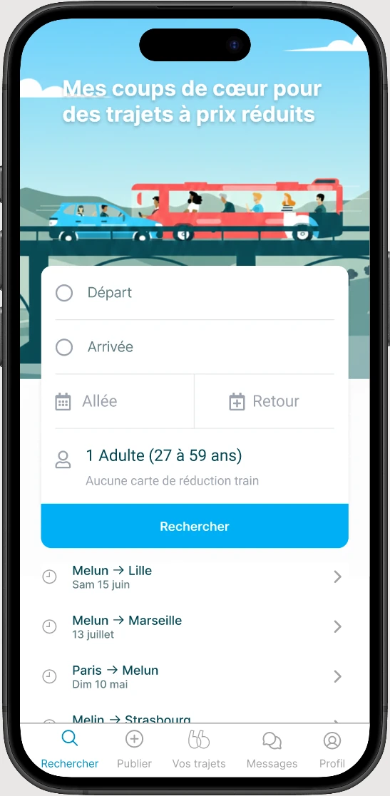
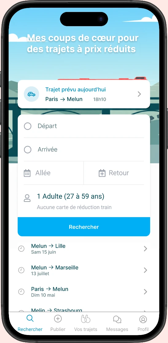
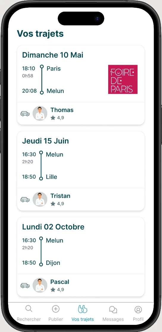
Viewing the upcoming trip
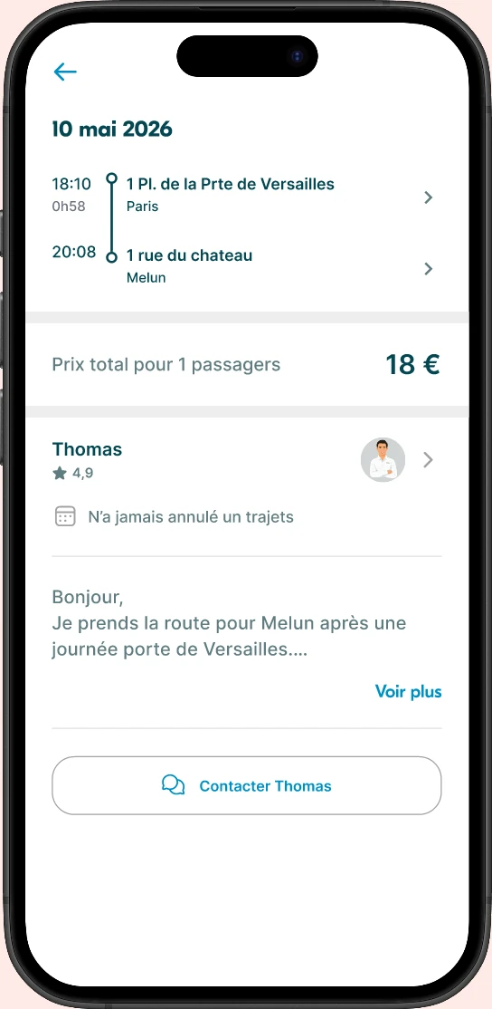
1
Upcoming trip display
The user opens the app and sees the upcoming trip they've booked.
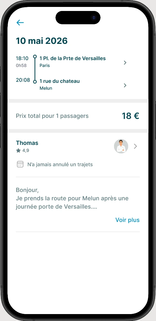
2
Trip details
Information about the departure point, departure time, and driver.
3
Meeting point
Visualization of the meeting point on the map with walking directions to get there.
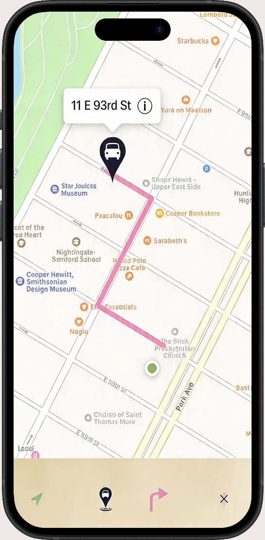
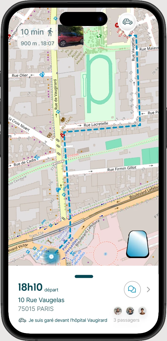
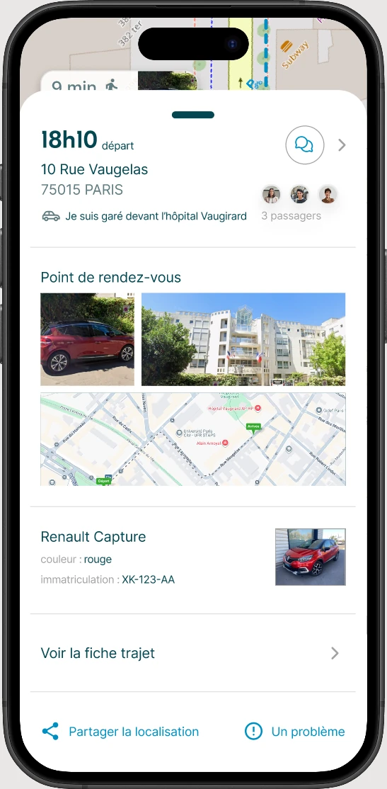
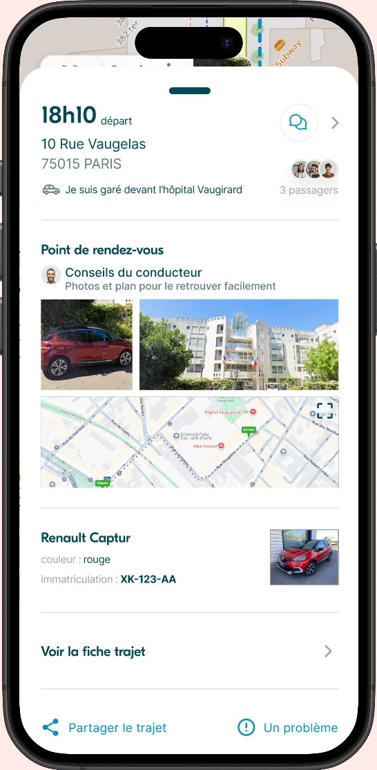
Meeting point information + route
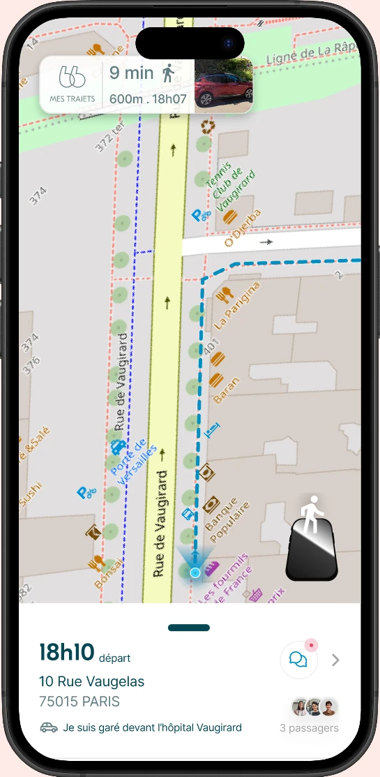
1
Map view screen
This screen gives access to various information
2
Meeting point information
The user can see the walking time, distance, and departure time. By clicking on the item, there's a zoom on the car photo and the license plate.
3
Trip details
By clicking on the destination point, the user can access the trip details.
4
Additional bottom sheet information
Closed: the meeting point address, driver info, passengers, and access to a chat.
Open: the meeting details, vehicle information, and trip details. At the bottom, the ability to share the meeting point location and a button to access BlaBlaCar support.
5
Opening/closing the bottom sheet
The bottom sheet can be opened by the small bar or by clicking outside the modal.
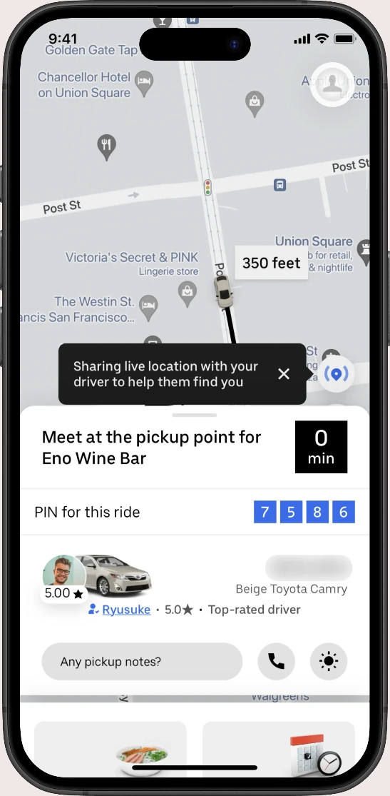
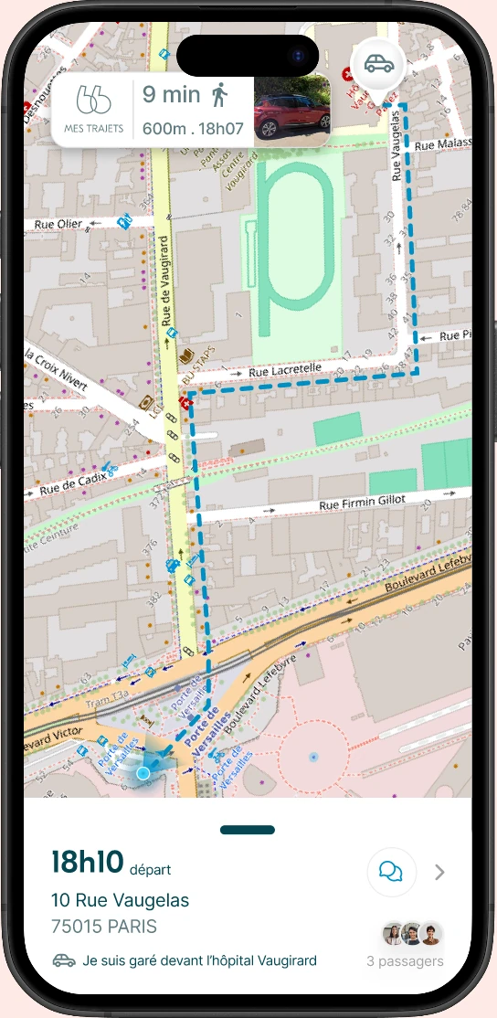
Map view navigation
1
Starting navigation
The user launches navigation to the meeting point in map view.
2
Following the route
The map displays the route to follow with directional indicators.
3
Arriving at the meeting point
The user arrives at the destination and can identify the driver's vehicle.
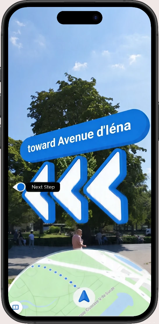
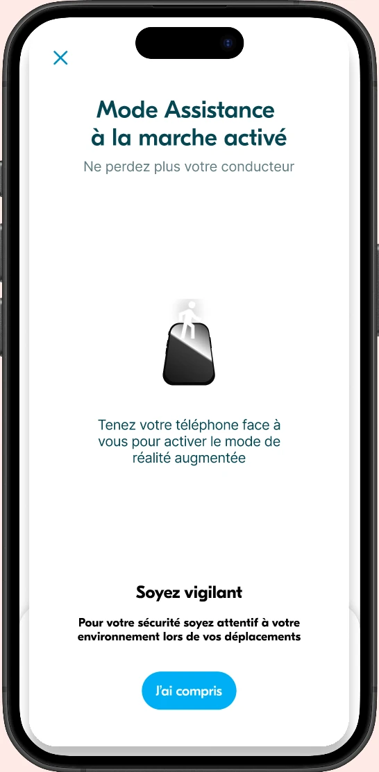
Augmented reality (AR) navigation
1
Departure to meeting point
Another way to follow navigation — the AR mode chosen by the user for their trip.
2
AR navigation mode
The user follows AR directions to find their way. There are orientation arrows and a bubble confirming the direction to the car's location.
3
Switching to map view
The passenger can switch back to the map view at any time to consult information differently.
4
Arrival at meeting point
The user switches back to AR until reaching the meeting point.
49 years old
Never used Blablacar before
25 years old
Has already used Blablacar
26 years old
Uses Blablacar often
31 years old
Has used Blablacar occasionally
24 years old
Has already used Blablacar
Verify the simplicity and relevance of the flow as a whole
Verify interest in the AR feature and check if guidance by blue arrows is intuitive
Check if the user can easily find their trip among the list
Check understanding of the Meeting Point and additional information
Verify the effectiveness of messaging with the driver via the integrated chat
Verify the usefulness of the bottom sheet for giving other information to the passenger
3/5
5/5
5/5
0/5
3/5
3/5
5/5
2/5
3/5
Iterations
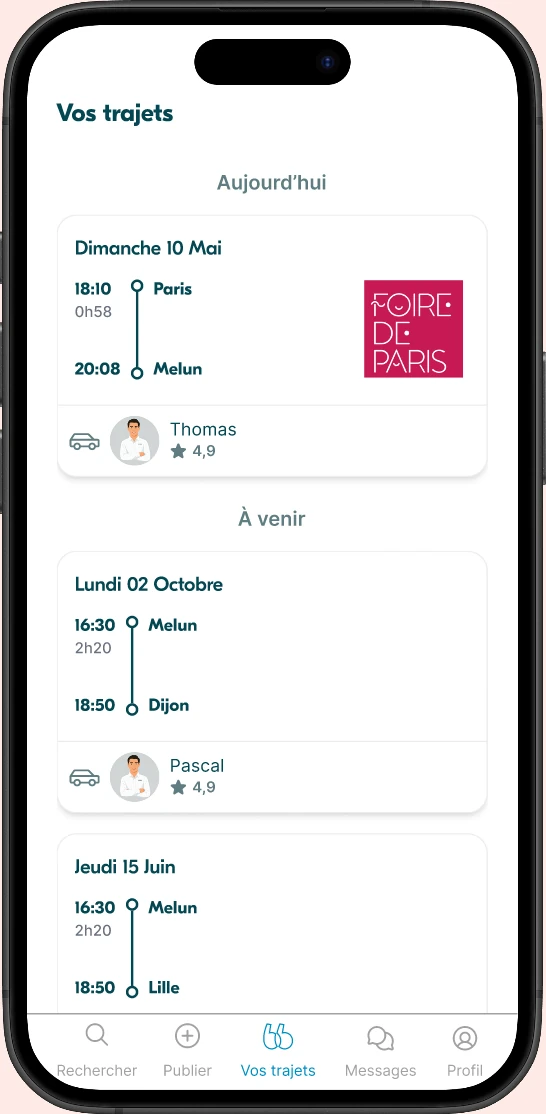
To simplify access to the event trip, a "Today's Planned Trip" button has been added to the home screen.
Iterations
One of our testers made a wise remark: "This is May 10th, which year? "
Indeed, our v0 was missing a time reference compared to trips.
We therefore added separators to frame the trips in a timeline.
Iterations
Photos attributed to Google Map
Personalization of the section with:
Map not clicked
Added a zoom icon to indicate interaction on the map.
On our initiative:
Iterations
During testing, 2/5 did not click on messaging. During discussions with one of the users, we realized it was impossible to know if there are new messages.
We therefore added a small red dot as an indicator of unread messages.
Iterations
During testing, 2/5 did not click on messaging. During discussions with one of the users, we realized it was impossible to know if there are new messages.
We therefore added a small red dot as an indicator of unread messages.
Iterations
We realized that distinguishing people by messages of different colors was more confusing than other things. This was raised in our step-by-step discussions.
Iterations
During testing, 2/5 did not understand the AR icon and did not use it. We therefore improved the visibility of the AR button with a clearer icon and an explicit label.
Iterations
We realized that distinguishing people by messages of different colors was more confusing than other things. This was raised in our step-by-step discussions.
The Design Crew team really appreciated our work.
Members particularly appreciated the integration of their new graphic charter with our solutions. They recognized the value of our UX approach, and the design choices were approved.
1
To obtain:
To verify that:
2
% of event users activating the Augmented Reality feature.
Method : Analytics
Frequency : Monthly
Threshold : > 20%
Satisfaction level after using the specific "Major Event" flow.
Method : Micro-survey from the app
Frequency : Post-trip
Threshold : 3/5
User's ability to return and use the feature during a second event.
Method : User cohorts
Frequency : Semester
Threshold : > 30%
% of users reaching their destination without route errors or major detours.
Method : GPS trip log analysis
Frequency : Weekly
Threshold : 80%
3
Given the difficulty of using standard messaging during lively events, offer intelligent and contextual reply buttons (e.g., "I'll be there in 5 minutes")
When driver and passengers attend the same event and share the round trip. How to manage the split of ancillary fees (e.g., parking) in the app?
How to reschedule an event departure in an anxiety-inducing situation, following a driver cancellation or traffic disruptions?
How to help drivers/passengers sharing the same event connect on the platform?
Vehicle location and details
Make driver's vehicle info accessible to the user on the day of the trip.